27.1.16

Assignments 3 - Fantasy Art

This is my new assignment, Fantasy Art.
I thought of combining something that can't be combined together, so I make a sky+sea manipulation.
When thought of sky, the first thing I remember is the invention of plane, while sea will be fish.
That's how I come up with "planefish".

http://bestwallpaperhd.com/wp-content/uploads/2013/01/boeing-787-wallpaper.jpg 

https://www.pinterest.com/pin/295759900509306455/

I masked out the plane and mermaid by using Quick Selection Tool.
Then, I used Puppet Warp Tool to change the tail's position.

To make both of them blend in well, I need to adjust the masked out area by changing Brightness, Contrast, and Color Balance.
I also used Brush Tool to blend the connection part together, But I change the brush preset to dots style brush.

This is how it looks like after that.

This is the first background that I manipulated.
I added some clouds png and corals png.
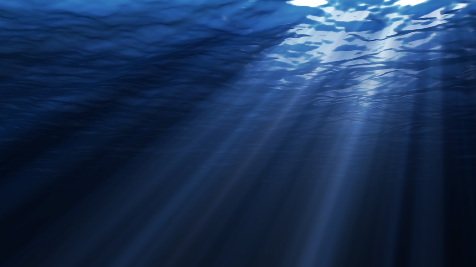
As for the undersea background, I duplicated 3 layers. First Layer is for the base look.
While the second and third layers I masked out the rays part, to make the object in between looks brighter.

http://ian.umces.edu/imagelibrary/albums/userpics/12865/normal_ian-symbol-gorgonian-sea-fan.png

 http://www.outworldz.com/Sculpts/cgi/files/textures-under-the-sea/textures-under%20the%20sea/coral-red.png


http://ian.umces.edu/imagelibrary/albums/userpics/12865/normal_ian-symbol-gorgonian-sea-fan.png 


Due to certain issues, I can’t show which cloud I used. Sorry.

As for the clouds, I just Googled for cloud png.

 http://www.wallpapervortex.com/wallpaper-11655_sky_clouds.html#.VqjEnfl97IU


This is the final product, I added the 'planefish', stingray, and pigeons.

I masked out the stingray.
Meanwhile, I only paste the pigeons, because I downloaded a png file that has a transparent background.
The only 'tricks' that I used is when I was adjusting the photo(Ctrl+T), I hold the arrow at the corner and pressing (Ctrl) at the same time.
Pressing Shift key will help the photo to zoom in and zoom out at the same ratio, while pressing Ctrl key will change the photo's composition corner by corner.
For me, I think it is something similar to puppet warp, you pin and twist the angle. Just that puppet warp tool is more flexible, you can choose any point to adjust.

I hope you enjoy the photo. :)

26.1.16

Assignment 2: Photobook


For this page, I just arrange the photos to make it look balance,
For some photo that I get online, I need to mask it out, since I just need some certain parts.
As for the word, I did't change the font that much, but I changed the font size and align to make it more proportion.


To be honest, it's the same technique that I applied to every page.
The difference is I added gradient rays for this page.
(Please refer Iron Man Photoshop Tutorial from previous post.)


Same techniques.

Same Techniques.

This is the Photobook I created. The theme is newborn baby celebration.
(My sister-in-law is going to have a baby, so yep.)

And I picked The Incredible as my source, since its my first movie in cinema, :D

I just play around in layer mask, typography, gradient, and desktop principles.

These are the resources that I found:

Quotes

The Incredible


Family photo (Baby)


21.1.16

Assignment 1: What I want to be. (My first real PHOTOSHOP)

Our assignment requires us to swap our face into the certain people or subject that we want to be.
At first I thought of tall buildings, but I can't decide which building.
Then, I thought of Yao Ming, China basketball player. (Ya, I wanted to be tall. Hmph.)

And our lecturer suggest us to swap face with animals instead, to test our skill.
I choose hedgehog. And recently I always see Pokemon posts, so I wanted to add it in too.


http://i.stack.imgur.com/ClbRc.png


https://i.ytimg.com/vi/-FDe3bwfCkU/maxresdefault.jpg


As for my selfie... I tried my best to look fierce, as I wanted to make the cute hedgehog look fierce after that. Just try to imagine yourself have a wide open mouth, raising the eyebrows and staring fiercely.

And...
It turns out to be funny instead. /.\
I played around with opacity to blend in with the colours, layer masking to get the correct position.
To make it looks more natural, when I mask, I set the brush to be more feathery, which can be done in brush preset. It is in right hand side panel, If can't find it, search Window from the top bar, display the brush preset then.


 The bottom left of the background actually got a box. To fix that, I used stamp tool and crop & copy the other corner, reflects it and adjust it. Then I use brush mixer for better blending. As usual, I'm lazy, so instead of mask out the basket ball, I picked color replacement tool to blend the basketball to the background and cover the trace with POKEBALL. And yes, its the mighty layer masking tool to make it happen again. And I used pen tool to select the cracking area, to mask the outer part, then top bar Filter>Blur>Gaussian Blur to make the 'windows' feel. 
And this is the final. :D
Of course I did some adjustment by using brightness, contrast, hue and saturation, color balance, curves to blend everything.

After I posted it on Facebook, my senior gave me advice that I should add the motion blur on the hedgehog, and I try to enhanced it with smudge tool, and this is it. Weeeeeeeee.

This is my Photoshop first real try, using other tools beside adjustment area, and mash up the layers.
It took me 3.5 hours(before adding motion blur), but I'm still proud of it. It comes out better than my expectations. :D

P/s: Always remember your best buddies: Ctrl+alt+z for undo, history list, and Ctrl+D for deselect.

13.1.16

Dispersion, Dust, Dissolve Pixel Effect

Tutorial: https://www.youtube.com/watch?v=1fr29zAlLKc
I follow exactly what he did.

Brush Mixer
Layer Masking, Brush Tool
Brush setting

Then I use the same brush setting, use Brush tool and change the color to white, slightly brush on the girl, because I want it to look more 'realistic'.

Resource:


http://www.hellocaller.com/wp-content/themes/hellocaller/library/images/plax-girl_floating.png


Easy text face photo.


Tutorial: https://www.youtube.com/watch?v=bWVzl8kklAA

The lesson that I learned from this tutorial: USE SMALL FONT TO GET THE DISTORT EFFECT.

Thank you Joel. By the way, you really have face problem. ;)

10.1.16

Text face photoshop


Tutorial: https://www.youtube.com/watch?v=bWVzl8kklAA
There's a lot of short cut sharings in it.

I learned something new:
Alt+delete: fill whole layer with color.
Alt+shift: enlarge or minimize a photo by keeping its center.
And while using dodge tool, I learn that we can choose range to edit either shadows, midtones, and hightlights part.

Thank you to our dear Paddington Bear: Raf (model).


9.1.16

The making of Iraf man


Reference: http://abduzeedo.com/ironman-view-interface-effect-photoshop

I actually repeated everything in the tutorial, in a lazy way. :P
For the Illustrator part, its actually easier if we just save the file in psd, then move the layer in.
But if you follow the tutorial, you can use the blending option like what he did.

And in blending option, I used linear light for the effects, so that it is glowing.

Good luck on following the tutorial. :)

P/s: Thank you RAF to be my model. ;)