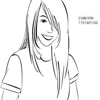
This is the first time using Adobe Illustrator, we change our own raster photo to vector image, it’s not a very hard process, and the hardest part is to make the outline smoother by using Delete Anchor Point Tool. Well… it’s still looks ‘rough’, but never mind; we did mistakes during learning process. J
This is my very first artwork in Adobe Illustrator.
(Previous one didn’t count, because it’s only image tracing, vectors it by
software and delete anchor points to make the outlines smoother.)
But this one also not that hard, we trace our own image by
using Pen Tool.
Controlling the curves is the headache part. Still need more
practices.
This is my sketch for first assignment, the theme is
disability.
I make my point as I’m Possible. (From the quote Impossible itself
says I’m possible.)
And Madam Ling says it’s better to focus on one object. So I
made some changing afterwards.
This is the first try for the assignment, and apparently
Madam Ling dislike the background (Too typical) and she prefer the word to be
place on the eye level. So I made another try.
Tool used: Man (shapes and pen tool), Background (shapes,
pen tool and gradient), and Words (Type, and to make the shadow thingy, I just
copy and paste then change the colours.)
Second Try, I think it’s quite obvious that I run out of
idea to improve the background, but surprisingly Madam Ling prefers this one.
:D
I did some improvements on the shading. And the background I
used Shape and Gradient. To make the shapes overlap nicely, I play around with
colours and transparency.
And the “I’m possible” supposed to be in one line, but I
lost the files, so… please imagine how it looks like in one line. Anyways,
designing works is about imagination. ;)
This is my third try on
assignment one. I try to focus on “I’m possible” only.
I try to make the ‘tools’
looks like splitting IM and POSSIBLE, and make some crackings on it… uhm it
FAILS, but never mind, behind success it’s always been failures. (I’m
optimistic, I know right.) :D
But I quite like the smiley
and OKU sign thou. ;)
It’s for Malaysia Independence Day. PLEASE DO IGNORE THE
SELAMAT BERDAULAT, I’m too blur that time.
I used all the colours in Malaysia flag. Orang Utan is used
because it’s one of our country’s significant animals. I use pen tool for almost
everything, except for the moon and typing.
As for the hibiscus… I think it’s pretty obvious, since it’s
our nation flower.
And to show the years of independent, I drew a 58 on the
flames, to represent its 58 years of MERDEKA.
Moon and star… that’s from our flag… It represents our
different but united Bandar-bandar.
It’s some exercise in class… It’s quite rushing, so… please
forgive me.
I’ve tried my best to make the texture obvious.
I used Pen Tool, Shapes, Brush, Reflects, Transparency and
Gradient to finish this work.
This is my first try on assignment two, still the same
theme: Disability.
The idea is to show the confidence of disabilities, it
doesn’t matter who you are, it doesn’t matter you are different from physically
or mentally, you are still the same as us.
Be more confident, stand out, and shout out your voices.
Alright, I like the OKU, U are more than OK J logo at the bottom
left. TEHEE. J
But the typography still needs some work on it.
So here’s the second try.
TADAAAAAAA. J
Tool used: Pen Tool, Brush Tool, Blob Brush Tool, Mesh Tool,
Blend Tool, Type Tool, Type on Path
Tool, Create Outlines.
Girl: Pen Tool, Brush Tool, Blob Brush Tool.
Moon: Pen Tool, Brush Tool, Blob Brush Tool, Mesh Tool,
Blend Tool.
Words: Type Tool, Type on Path Tool, Create Outlines.


No comments:
Post a Comment